
 English
  Portuguese


I’ve refined the description to better match the specific content highlighted in the image you provided.
YouTube Thumbnails Concepts | Digital Art by Alexandre Silva
Unlock the power of visual storytelling with captivating YouTube thumbnails designed by Alexandre Silva. This page features a dynamic collection of thumbnail concepts optimized to boost views and engagement. Discover a variety of styles, from bold and energetic to clean and minimalist, showcasing techniques in:
-
Eye-Catching Typography: Learn how to use fonts and text layouts that grab attention.
-
Compelling Imagery: Explore the use of striking visuals, emotive expressions, and strategic compositions to tell a story at a glance.
-
Brand Cohesion: See examples of how thumbnails can be designed to maintain brand identity and create a recognizable visual style.
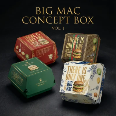
Showcase Examples: (As seen in the image, these are examples of Thumbnails on YouTube and TikTok
-
Various thumbnails are showcased in areas like: YouTube, TikTok
Elevate Your Channel:
Draw inspiration from these thumbnail designs to create a cohesive identity that celebrates quality and simplicity.
Explore more and brew your brand’s story today!


Showcase Tiktok


Showcase Thumbnails


Creative Process
This thumbnail collection was developed as an exploration of visual impact, clarity and storytelling at a very small scale. The goal was to create concepts that could attract attention in busy YouTube, TikTok and social media feeds while remaining easy to understand in a single glance.
Finding the Visual Hook
Each concept began with one central idea: a face, an action, an object or a short phrase capable of communicating the subject immediately. The strongest element was given priority, while secondary details were reduced so that the composition would remain legible even when displayed as a small preview.
Composition and Hierarchy
The layouts were built around contrast and clear focal points. Scale, framing and negative space helped separate the main subject from the background. Text was kept concise and positioned to support the image rather than compete with it, creating a simple reading order from the first visual cue to the supporting message.
Colour and Typography
Bold colour relationships and expressive typography were used to define the tone of each thumbnail. Every combination was tested for readability and emotional impact, with adjustments to outlines, shadows and spacing whenever the content needed additional separation.
Refinement
The final stage involved comparing variations and removing anything that weakened the message. The result is a diverse set of thumbnail concepts with a shared focus on immediate recognition, strong visual hierarchy and platform-ready communication.