
Creative Process

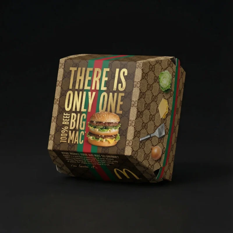
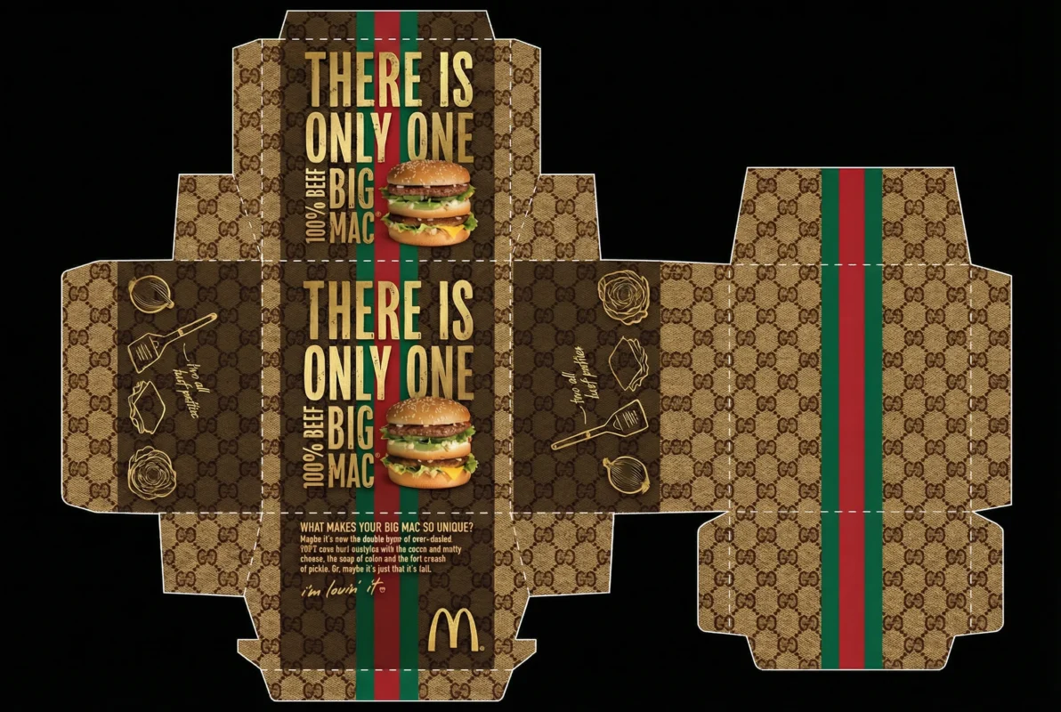
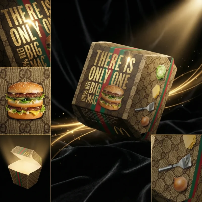
This project reimagines the familiar Big Mac box through the visual language of four luxury houses. The creative challenge was to preserve the instantly recognisable packaging format while changing its personality through colour, pattern, typography, surface finish and presentation.

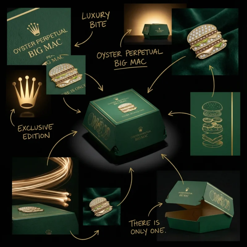
Big Mac Concept Box – Rolex

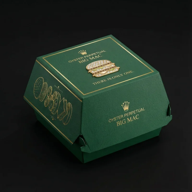
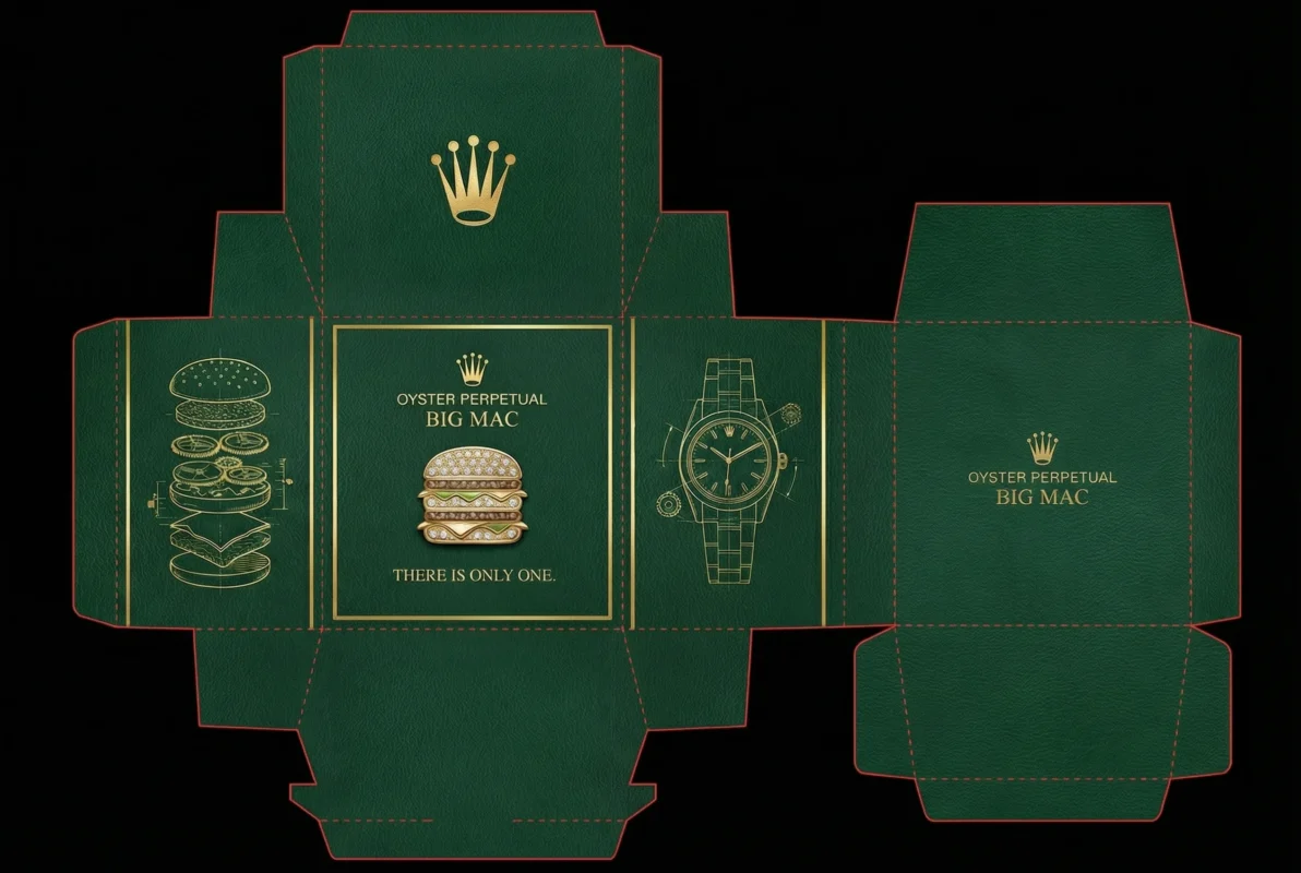
The Rolex-inspired box uses deep green, gold accents and controlled detailing to evoke precision and prestige. The graphics were adapted carefully to the folds and panels of the package, then presented with lighting that emphasises the contrast between matte and reflective finishes.
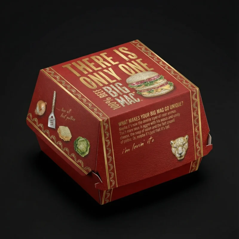
Big Mac Concept Box – Cartier

For the Cartier direction, the design shifts to a refined red palette with elegant gold details. The visual hierarchy was kept clean and symmetrical, allowing the colour, typography and jewellery-inspired finish to carry the identity across every angle of the box.

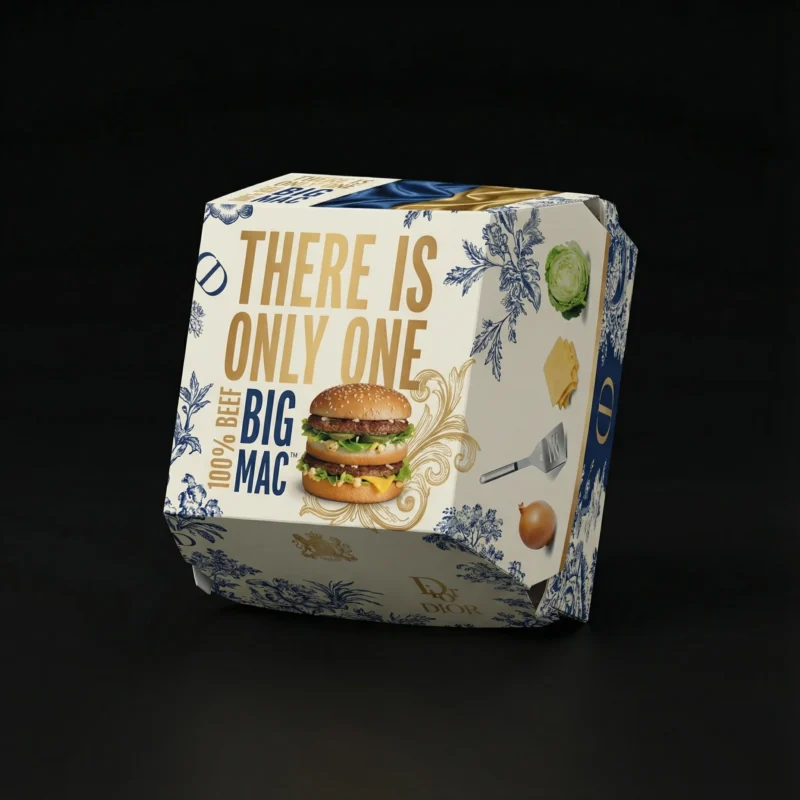
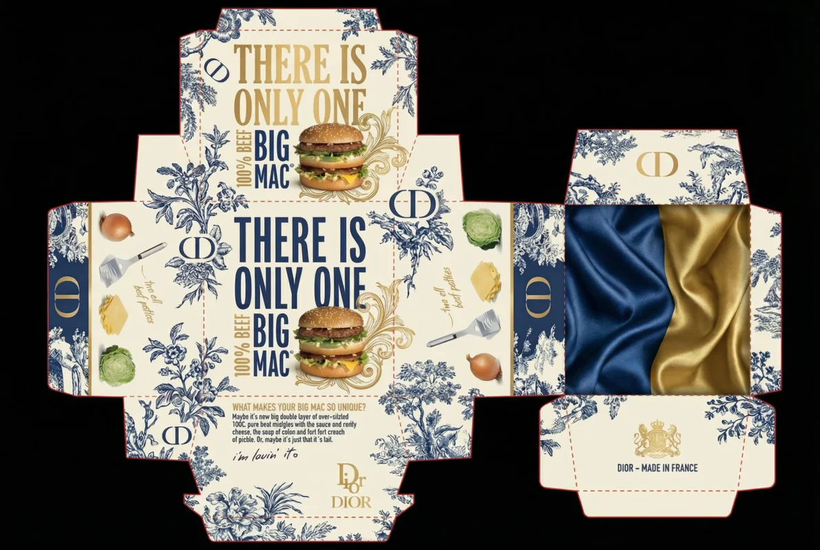
Big Mac Concept Box – Dior

The Dior concept explores a lighter, fashion-led character through pattern, proportion and a more delicate surface treatment. Each view was composed to show how the graphic language continues around the package while retaining the functional structure of the original box.

Big Mac Concept Box – Louis Vuitton

The Louis Vuitton-inspired version focuses on repetition, recognisable pattern and rich brown tones. The final presentation combines close material detail with broader product views, showing both the crafted surface and the complete packaging silhouette.