Showcase — Brand Identity for AWA Perfume
The AWA perfume campaign was developed as a complete luxury brand world rather than a collection of isolated visuals. The creative process connected identity, product presentation, packaging, digital interfaces and advertising around two central ideas: the “Golden Scent” visual language and the atmospheric character of the “Majestic Aura” fragrance line.
My objective was to create a campaign that felt refined, cinematic and consistent across every customer touchpoint. Each application needed its own composition and purpose, while still belonging unmistakably to the same fragrance story.
Defining the Creative Direction
The process began by identifying the emotional territory of the brand. A luxury perfume is not communicated only through the bottle; it is communicated through mood, material, light and suggestion. I wanted the AWA campaign to evoke warmth, mystery and exclusivity without relying on excessive visual decoration.
The name and “Majestic Aura” positioning suggested an atmospheric direction. Desert-inspired tones, golden light and deep shadows became the foundation of the visual system. These elements created a sense of heat and distance while giving the product a premium, sculptural presence.
I used a focused set of creative principles to guide every asset:
- Warm metallic tones to express value, radiance and the “Golden Scent” concept.
- Cinematic contrast to give the bottle and campaign imagery depth.
- Controlled typography to keep the identity elegant and legible.
- Generous negative space to support premium positioning.
- Consistent art direction so that print, digital and environmental applications felt connected.
Building the Product Presentation
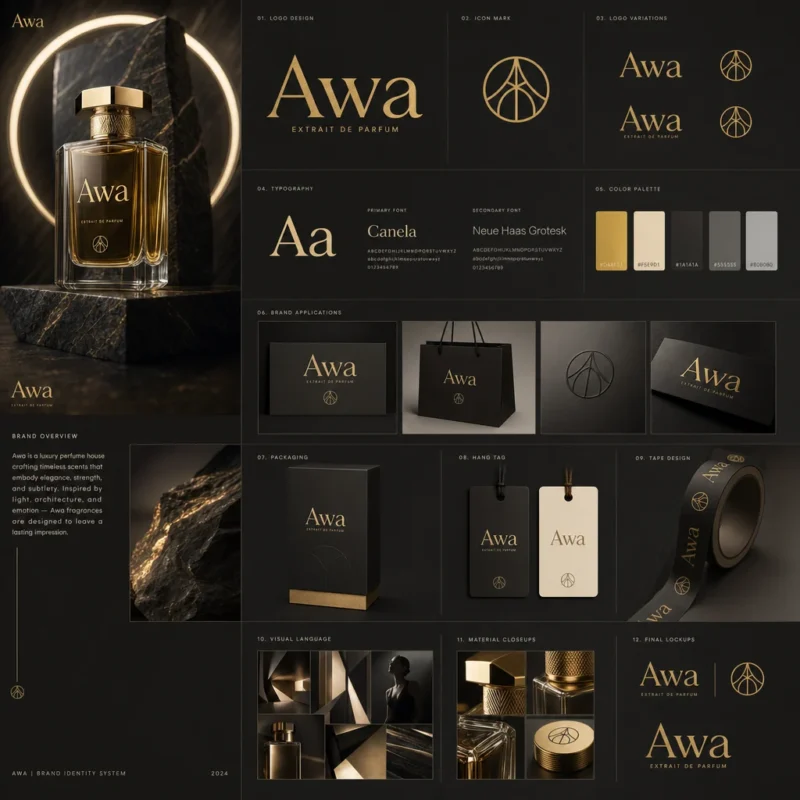
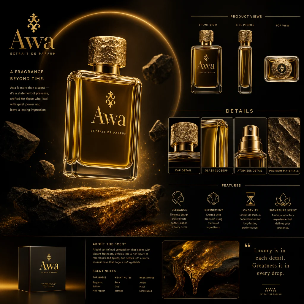
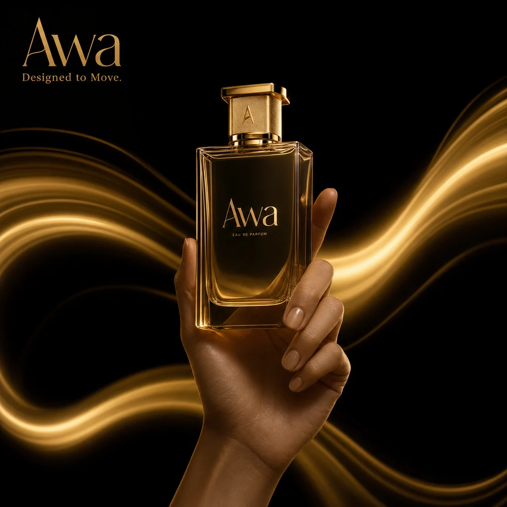
The product presentation board brought the main parts of the identity together in one structured composition. This stage was useful for testing how the logo, bottle, colors, typography and supporting imagery behaved as a system rather than as separate design decisions.
Premium Product Presentation Board
The board needed to communicate the campaign quickly. Visual hierarchy therefore became essential: the product acts as the focal point, while the surrounding brand elements provide context. The layout balances detail with breathing room so that the presentation feels curated rather than crowded.
This step also established a reference for the assets that followed. By defining the relationship between imagery, type and color early, I could adapt the campaign to different formats without redesigning the visual language each time.
Designing the Campaign Poster
The poster was approached as the clearest expression of the campaign idea. It had to stop the viewer, communicate luxury and make the fragrance memorable within a single frame. The desert-inspired atmosphere supports the emotional story, while the product and brand message remain visually dominant.
Premium Campaign Poster
I treated the lighting as part of the graphic design. Golden highlights lead the eye through the composition, while darker areas create focus and give the brighter surfaces more intensity. The typography is positioned to complement the image rather than compete with it.
The result established the tone for the wider advertising campaign: cinematic, warm and confident, with a visual identity that could remain recognizable even when the format changed.
Translating the Brand into a Mobile Experience
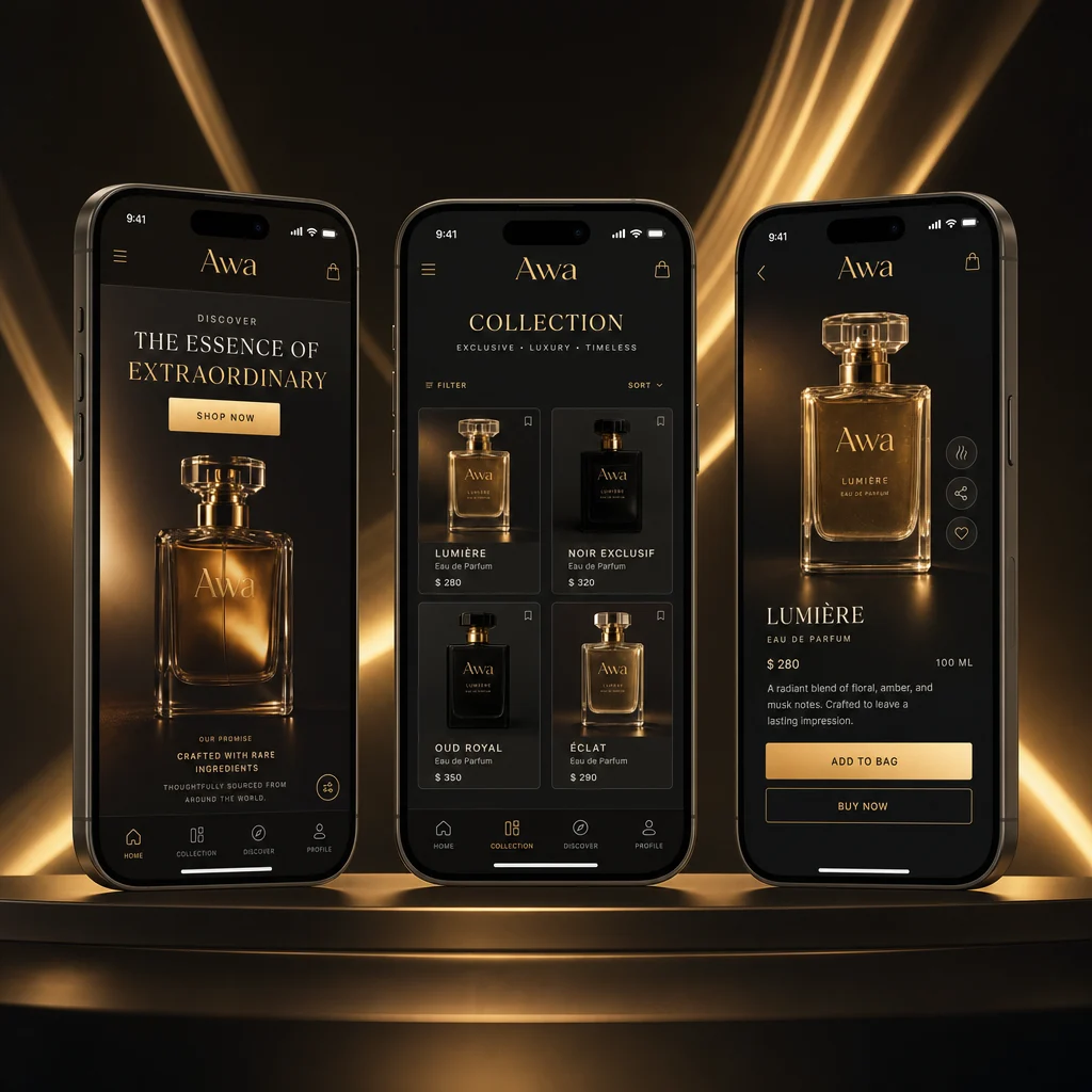
Moving the campaign into a mobile interface required a different kind of discipline. The atmospheric qualities of the brand needed to survive on a smaller screen, where clarity, hierarchy and interaction become more important.
Premium Mobile App UI Presentation
The interface presentation uses the campaign imagery as an emotional entry point, while the layout keeps product information and navigation readable. The goal was to preserve the luxury feeling without allowing decorative elements to reduce usability.
This adaptation demonstrates an important part of the process: consistency does not mean copying the same composition into every medium. It means preserving the same brand character while responding to the needs of each format.
Developing the Luxury Packaging
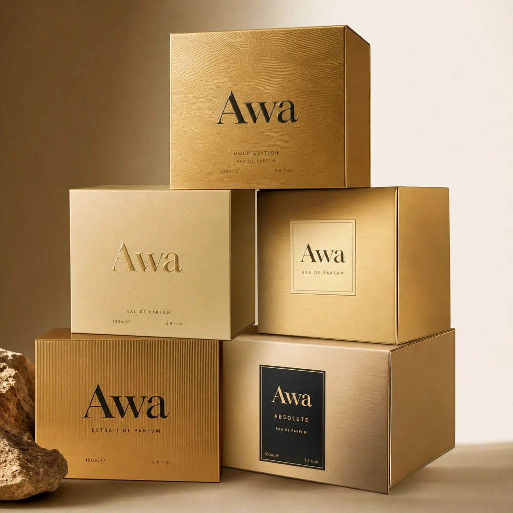
Packaging is where the identity becomes physical. For the AWA concept, the bottle and box needed to feel like objects with presence before the fragrance was ever experienced. Proportion, surface finish, typography and the relationship between gold and darker tones all contributed to that perception.
Premium Luxury Perfume Packaging Design
I kept the packaging language focused so the materials could carry much of the visual impact. Metallic details suggest light and value, while the restrained composition helps the product avoid feeling overdesigned. The “Majestic Aura” identity remains central, allowing the packaging to connect directly with the campaign poster and digital assets.
Extending the Story to the Website
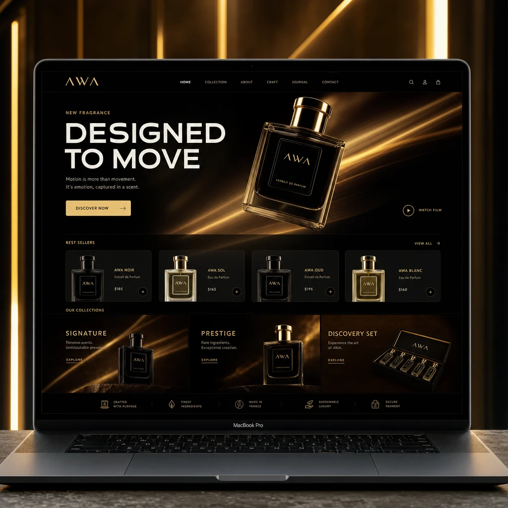
The website concept was designed as a digital continuation of the campaign. Rather than presenting a standard product grid, the visual direction introduces the fragrance through atmosphere and storytelling before moving towards product information.
Premium Luxury Perfume Website Presentation
Large imagery provides immersion, while the interface elements remain deliberately restrained. This balance allows the website to feel editorial and premium without losing the clarity expected from a product experience.
The layout also shows how the identity can scale from a compact mobile presentation to a wider digital canvas. The same palette, typography and art direction remain present, but the extra space creates a slower and more cinematic rhythm.
Creating the Fashion Editorial Visual
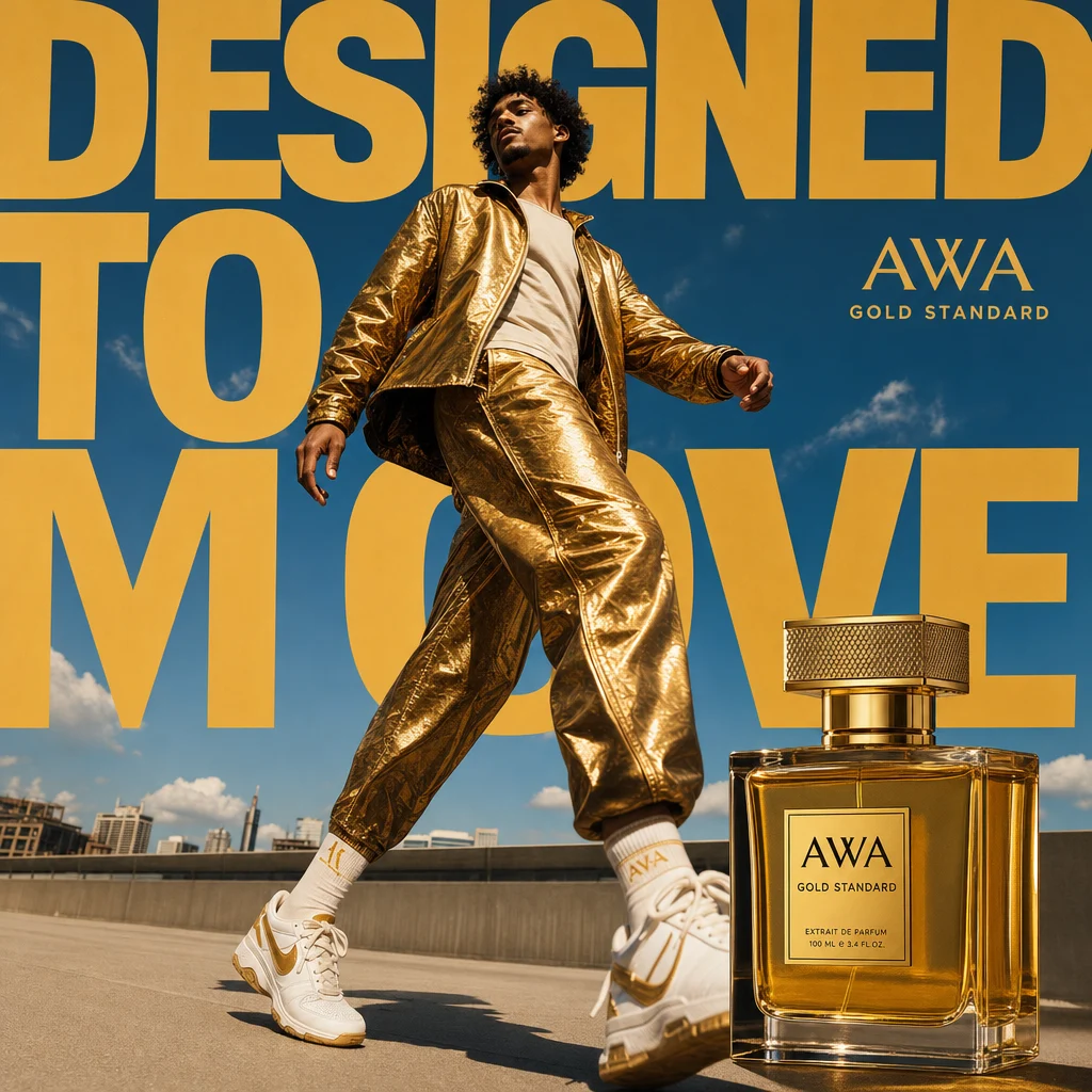
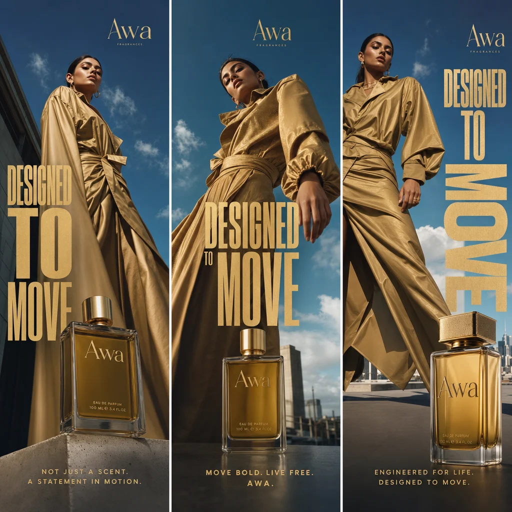
The fashion editorial asset expanded the campaign beyond the product bottle. Introducing a human presence allowed the fragrance to communicate attitude, aspiration and lifestyle. The visual needed to feel part of the AWA world while adding a more expressive narrative layer.
Luxury Fashion Editorial Ad Campaign Visual
The editorial composition uses styling, pose, light and environment to suggest the personality of “Majestic Aura.” Rather than describing the fragrance literally, it builds an emotional association around confidence, elegance and mystery.
This asset helped broaden the campaign language. It demonstrated that the identity could support both product-focused advertising and more aspirational storytelling without losing visual consistency.
Adapting the Campaign for a Billboard
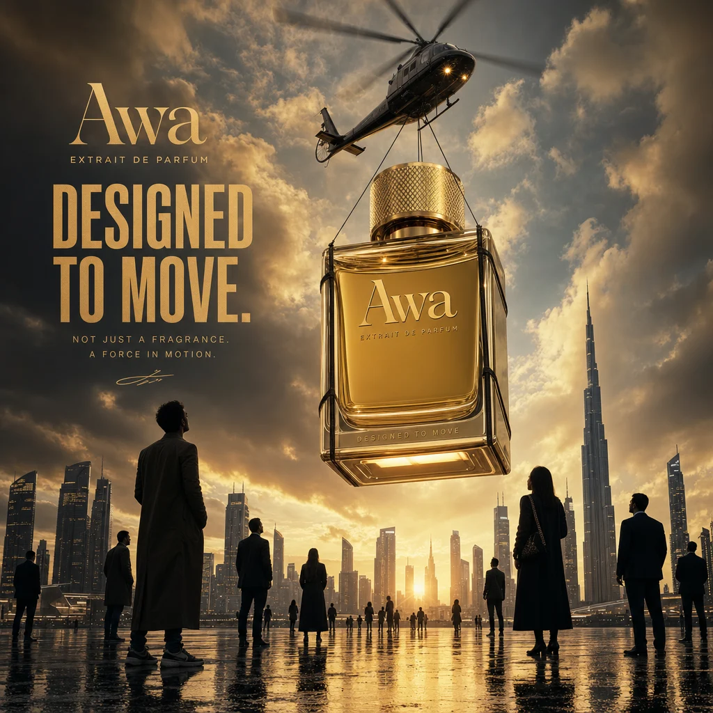
A billboard has only a short moment to communicate. The composition therefore had to become simpler and more immediate. Product, brand and core campaign message needed to remain clear from a distance, with enough contrast to survive a large outdoor format.
Premium Billboard Campaign Visual
I reduced visual competition and strengthened the main hierarchy. The atmospheric background still carries the “Golden Scent” mood, but the product and identity remain the elements that viewers can recognize first.
This stage tested the flexibility of the campaign system. A visual language that works only in a portfolio mockup is not enough; it should also retain its character when adapted to a demanding real-world format.
Designing Social Media Campaign Creatives
The social media assets completed the system by adapting the campaign to fast-moving digital channels. These formats need immediate visual recognition while still providing enough variety to support multiple posts.
Social Media Campaign Creatives
I used the established palette, typography and product treatment as consistent anchors. Variation came from framing, scale and the balance between product-led and atmosphere-led compositions. This approach allows a campaign to remain recognizable without repeating the same layout.
What I Learned from the AWA Project
The central lesson was that luxury branding depends on restraint and continuity. Every visual decision needs a reason, and every application should strengthen the same perception of the product. Adding more elements does not automatically create more value; often, careful spacing, controlled light and material detail communicate premium quality more effectively.
The project also reinforced the importance of designing a system before producing a large number of assets. Once the campaign rules were clear, each new format became an adaptation of a shared idea rather than an unrelated design exercise.
Most importantly, the AWA showcase demonstrates how one creative concept can connect brand identity, packaging, UI design, web presentation, editorial advertising, outdoor media and social content. The finished campaign feels coherent because every piece returns to the same emotional and visual foundation.
Final Result
The AWA “Majestic Aura” campaign presents a fragrance brand through a complete visual experience. The “Golden Scent” direction gives the identity warmth and distinction, while the desert-inspired art direction creates an atmosphere that can move naturally between physical and digital applications.
Explore more multidisciplinary brand and visual work in my portfolio, or get in touch to discuss a branding, campaign or digital art direction project.

 English
  Portuguese